Overview
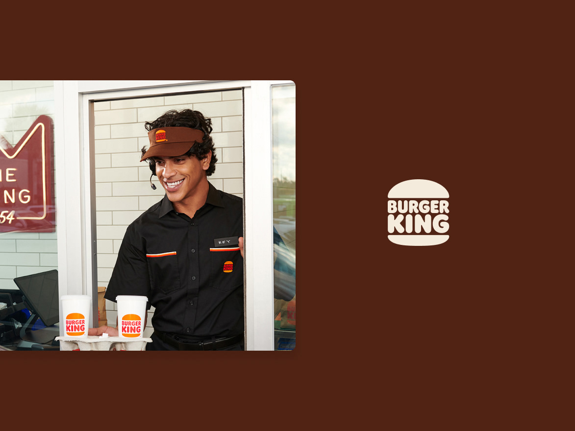
Burger King is a quick-service restaurant brand with multiple digital sales channels, including mobile apps, websites, and kiosks—the latter accounting for 41% of digital sales traffic. The goal of this project was to optimize the self-ordering kiosk experience through incremental UX enhancements to increase adoption and conversion.
As the lead and solo designer for the kiosk, I defined the design strategy and collaborated closely with a cross-functional team to align business goals with user needs. I also coordinated design requirements and partnered with the external software and hardware vendor to ensure each feature release was implemented with high-quality, user-centered design.
Legacy kiosk designs were provided by the external vendor before system standardization.
Work Process
1. Discovery Sessions
Conducted discovery sessions to align business strategy with user needs, advocating for early stakeholder immersion to foster collaboration and informed decision-making. Focused on identifying key pain points and generating innovative solutions through a deep understanding of end-users.
One key insight was that many customers bypassed the kiosk and went straight to the counter. This led to a new in-store initiative improving signage and kiosk placement, which increased kiosk usage and optimized customer flow, reducing crowding at the counter.
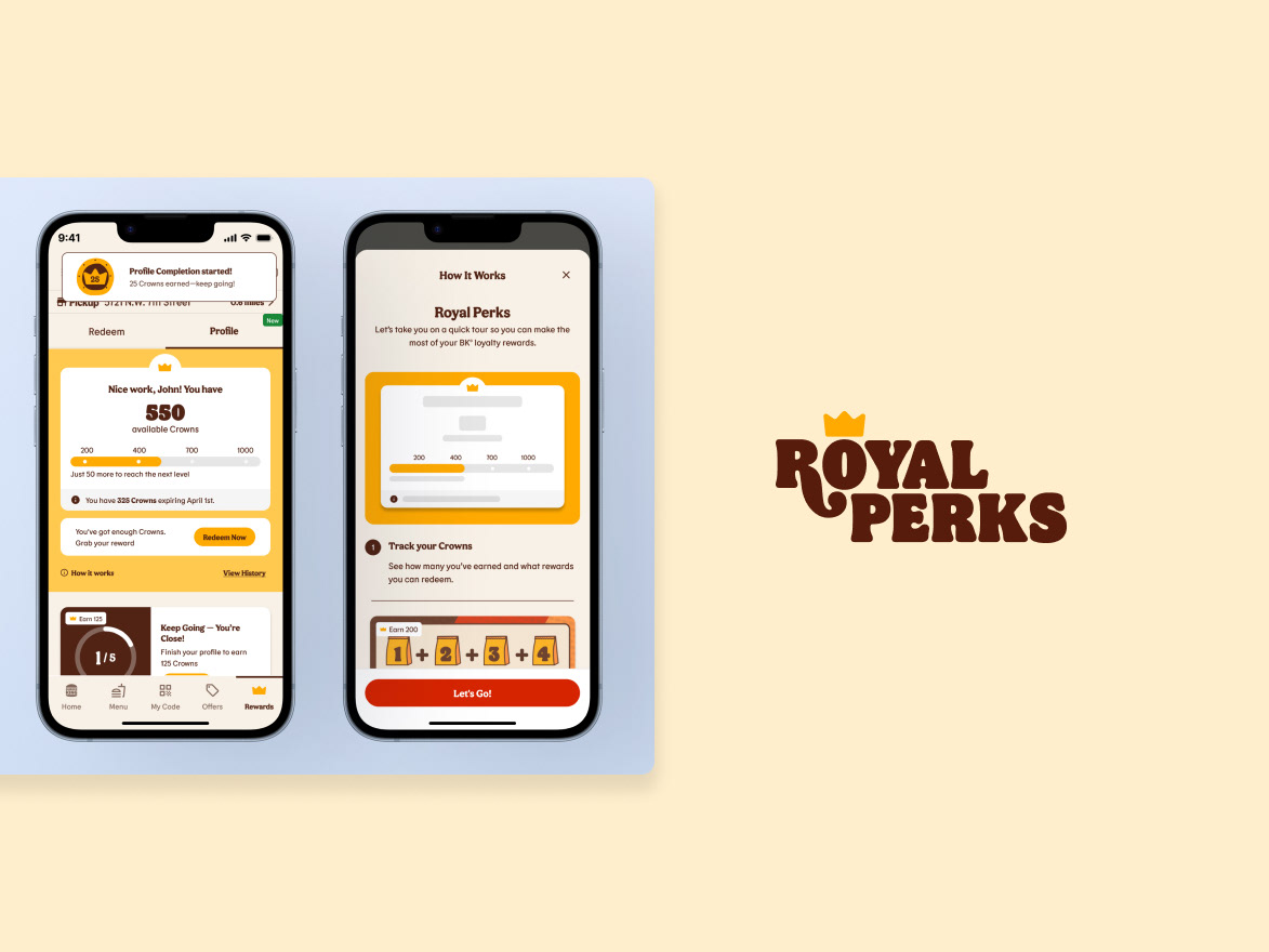
2. Loyalty at Kiosk
Burger King’s Royal Perks loyalty program was initially available only at the kiosk. Through user interviews and in-store observations, I identified opportunities to enhance the loyalty flow and overall kiosk experience.
I advocated for early stakeholder immersion and led a workshop with the Loyalty Marketing team to identify key opportunities to improve customer retention and attract new loyal guests through the kiosk. My design thinking approach informed the strategic roadmap for the product manager and marketing stakeholders, guiding actionable improvements to the loyalty experience.
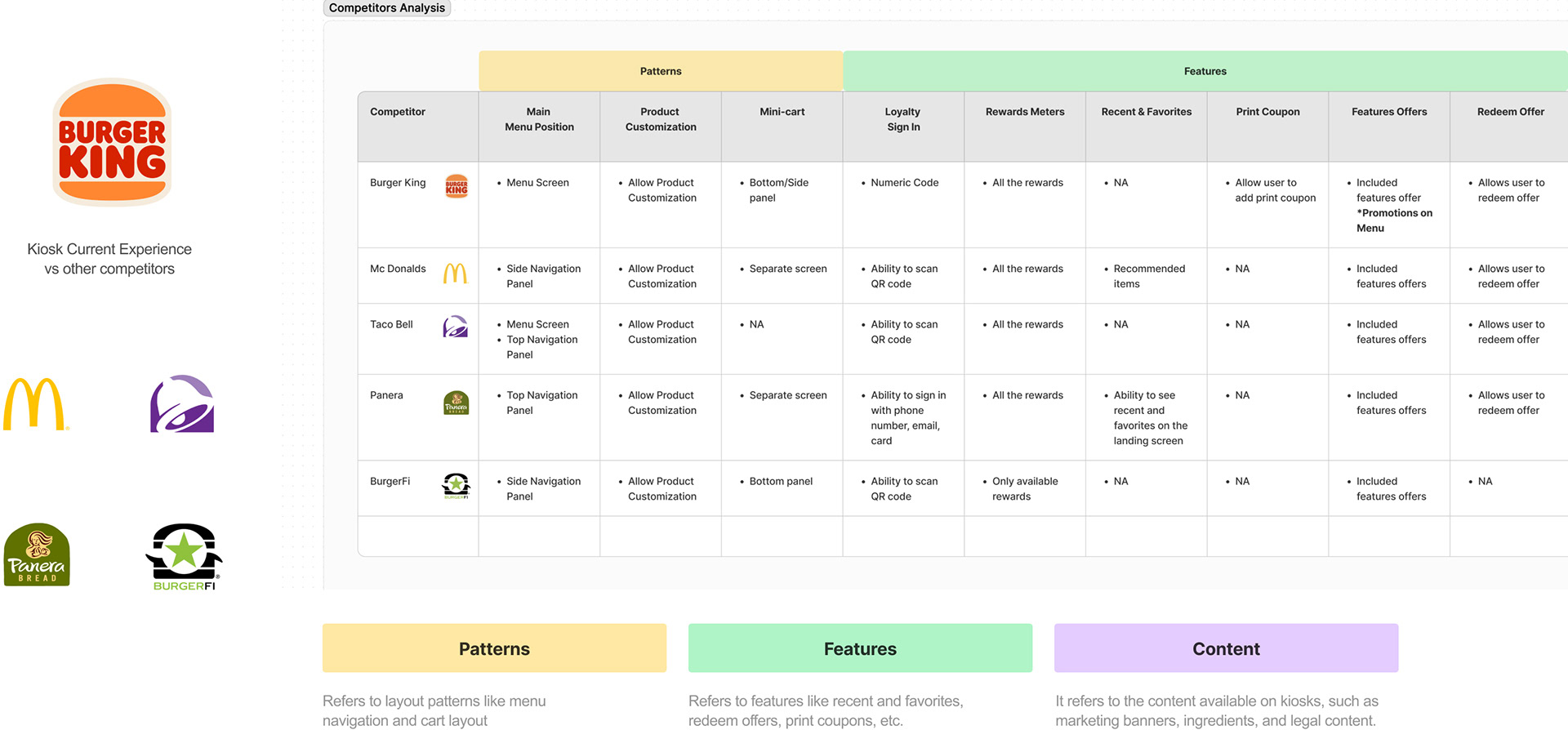
Example of competitive analysis to understand common design patterns, features, and content from other QSR brands.
3. Research
Planned and executed research activities to uncover user pain points and generate actionable insights. I also trained junior designers in research practices, including unmoderated testing, and promoted best practices for usability reporting. Additionally, I collaborated with external vendors and product managers to improve the data analysis process, ensuring research findings could directly inform design decisions.
Key research methods included:
• User testing (moderated and unmoderated)
• A/B and usability testing
• In-store observations
• Competitive analysis
• UX/UI audits
• User testing reports
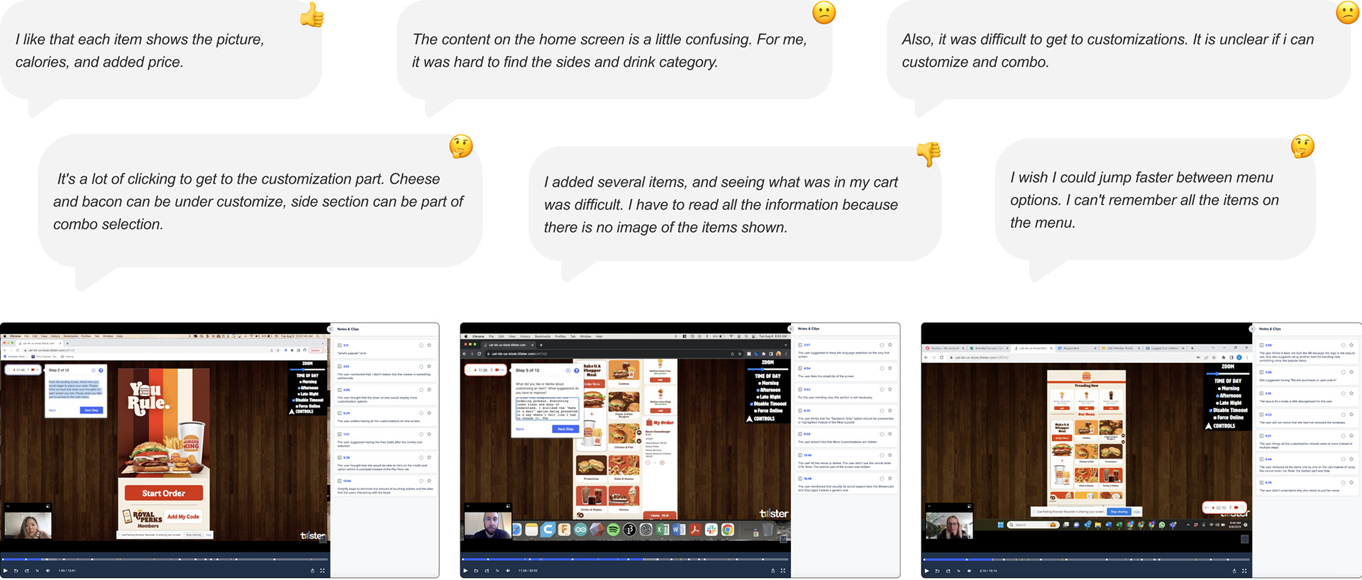
A discovery session on user testing will be held to identify pain points, usability issues, and areas of improvement in the experience.
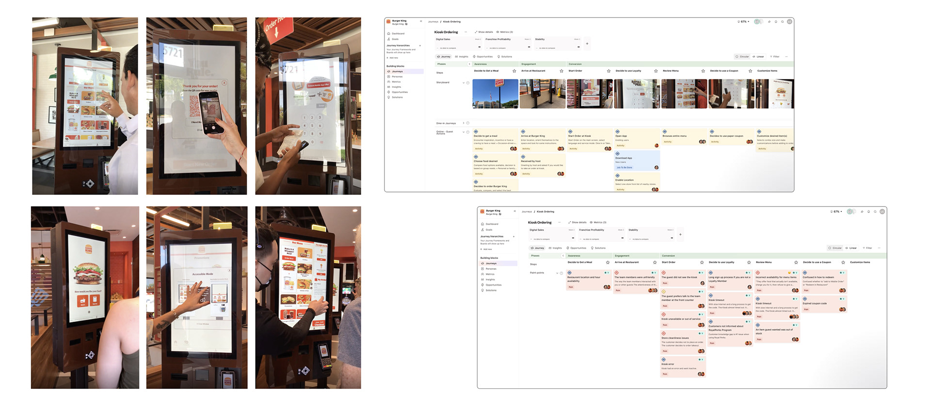
In-store observational research and interviews were conducted in Miami to understand users' general perceptions, usage patterns, and usability issues in the kiosk flow.
4. Defining Work-Streamlines
Collaborated with the Design Director to define the project scope and lines of work, and conducted sessions with development and product leadership to prioritize focus areas.
We aligned on a dual-track strategy:
“North Star” Ideal Design: explore the optimal solution without constraints.
Legacy Design as MVP: iteratively improve the existing kiosk experience with incremental enhancements.
This approach allowed design decisions to flow both ways—validating ideas in the ideal solution and applying insights to the legacy system. I led the presentation of this strategy to the cross-functional team, guiding alignment and informing the project’s next steps.
5. UX Strategy
I influenced UX and business strategy by leveraging research insights to inform roadmaps and core initiatives, and by collaborating closely with the Product Manager to align user needs with business goals.
For example, we explored the question: How could we better use the home screen? Guests should be able to quickly understand their options, including the option to order in their preferred language. Research and data showed that Spanish accounts for ~8% of transactions systemwide and ~20% in the Miami DMA.
Based on these insights, I identified a key opportunity to improve kiosk adoption among Spanish-speaking guests. This initiative, informed by in-store observations and data, is now a crucial effort to make kiosks more inclusive and drive engagement.
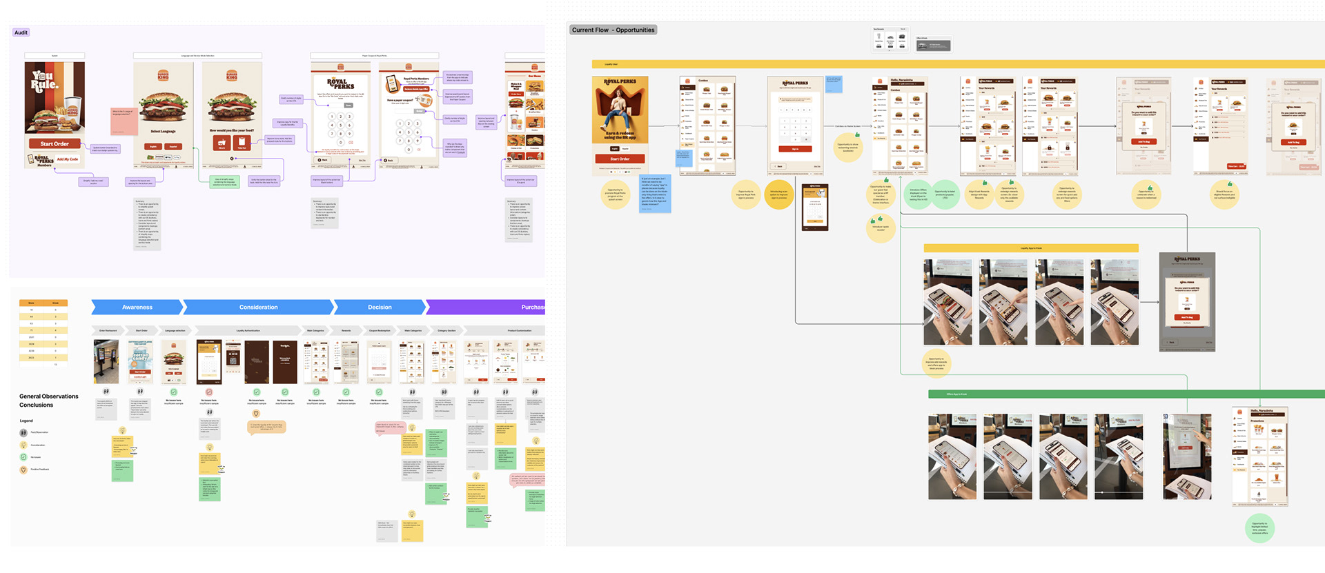
Examples of FigJam boards with audits and multiple workshop sessions with stakeholders to define opportunities and strategy.
6. User Experience
Collaborated with product managers and cross-functional teams to rapidly propose solutions for UX challenges, executing two-week sprints to deliver high-impact design improvements for both business and customers.
Key projects included:
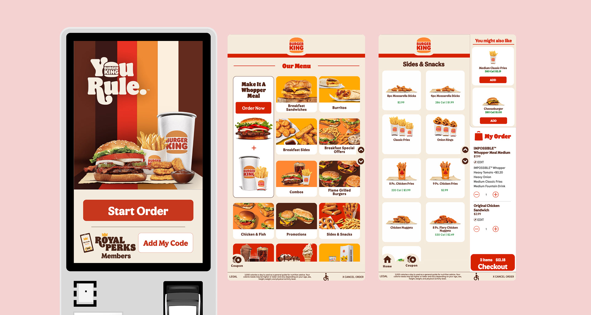
Improved kiosk navigation: Streamlined access to menu categories and items throughout the ordering experience.
Landing screen optimization: Early ideation and iterations to use the home screen as “Order Here” signage, increasing kiosk adoption, and highlighting language selection for Spanish-speaking guests.
Upsell design: Strategically guided customers toward add-ons to enhance average check value.
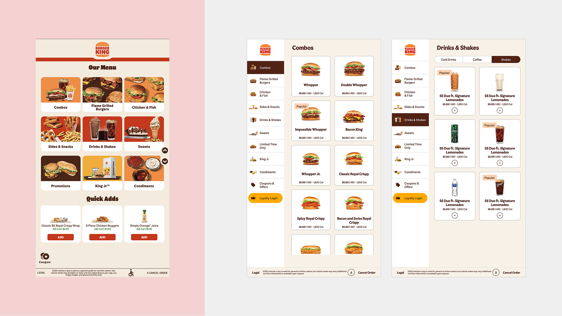
Left — Legacy design
The legacy Main Menu requires guests to tap a category, then return to the main screen to find more options. Navigation is fragmented, slowing quick product selection.
The legacy Main Menu requires guests to tap a category, then return to the main screen to find more options. Navigation is fragmented, slowing quick product selection.
Right — Improved design
Straightforward, streamlined navigation with easy access to all categories. Combos—the most tapped kiosk option—are front and center, supported by a cleaner layout and improved content structure for faster, more intuitive choices.
Straightforward, streamlined navigation with easy access to all categories. Combos—the most tapped kiosk option—are front and center, supported by a cleaner layout and improved content structure for faster, more intuitive choices.
The user interface has been a key focus throughout the kiosk initiative. Through incremental updates to the legacy UI, I’ve modernized and improved the user experience while working within the constraints of the existing vendor implementation. Quick prototypes are central to my methodology, allowing me to validate early concepts and replicate key interactions during user testing to ensure task success.
The design system has already been established—see the dedicated BK Kiosk Design System case study for full details. I focused here on applying the system to improve the UI and preparing the current implementation for a full vendor-led revamp.
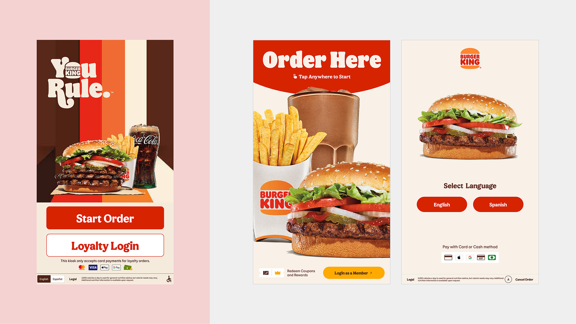
Left — Legacy design
Limited space for marketing promotions and unclear signage, making it difficult for guests to immediately recognize that they can order at the kiosk.
Limited space for marketing promotions and unclear signage, making it difficult for guests to immediately recognize that they can order at the kiosk.
Right — Improved design
A simplified splash screen that highlights food offerings and features a clear “Order Here” call to action. Includes a secondary loyalty login, with language selection as a follow-up step and a seamless loop between English and Spanish.
A simplified splash screen that highlights food offerings and features a clear “Order Here” call to action. Includes a secondary loyalty login, with language selection as a follow-up step and a seamless loop between English and Spanish.
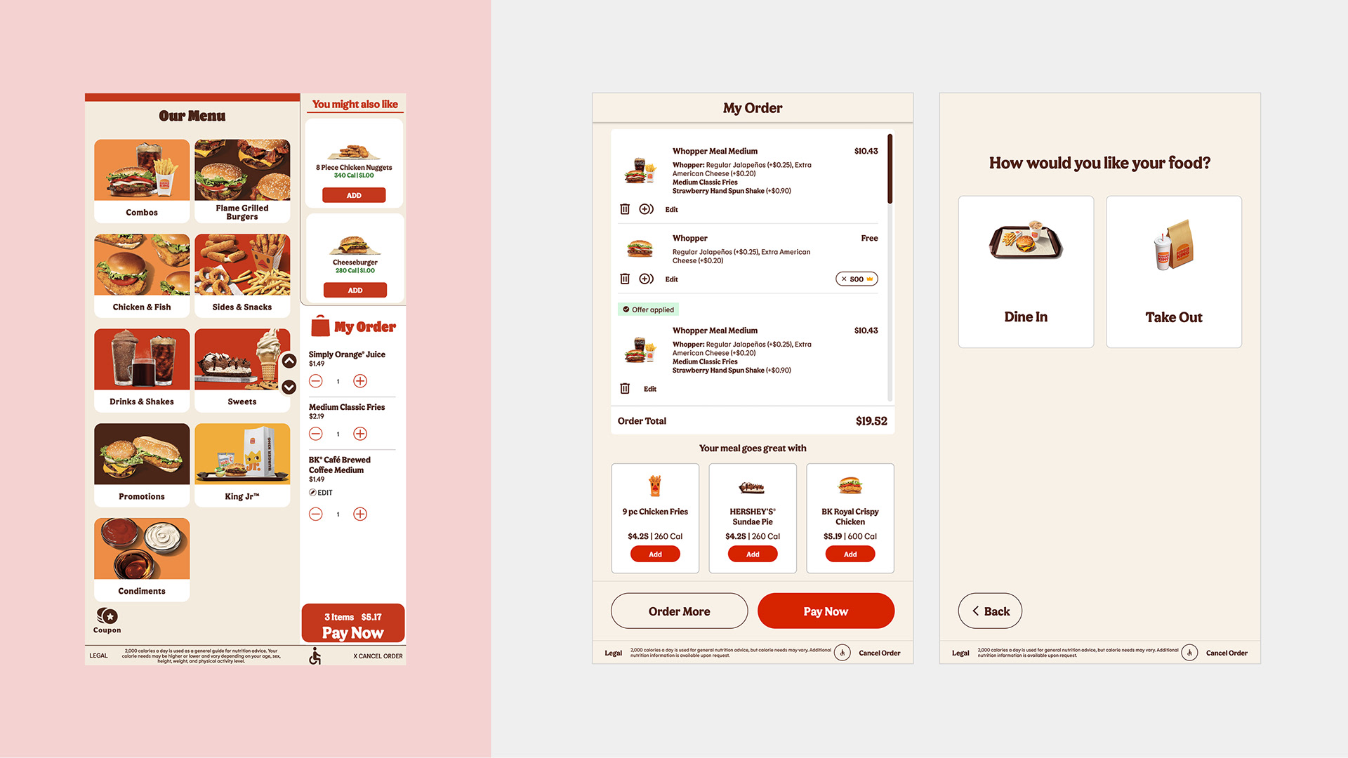
Left — Legacy design
The current Cart view falls behind competitors by not using product imagery and limiting content to a small vertical space, reducing clarity and engagement.
The current Cart view falls behind competitors by not using product imagery and limiting content to a small vertical space, reducing clarity and engagement.
Right — Improved design
Allows guests to expand and collapse the cart for a clearer view of the menu and upsell items.Creates space for consistent navigation, such as a persistent left rail, improving usability and wayfinding.
Allows guests to expand and collapse the cart for a clearer view of the menu and upsell items.Creates space for consistent navigation, such as a persistent left rail, improving usability and wayfinding.
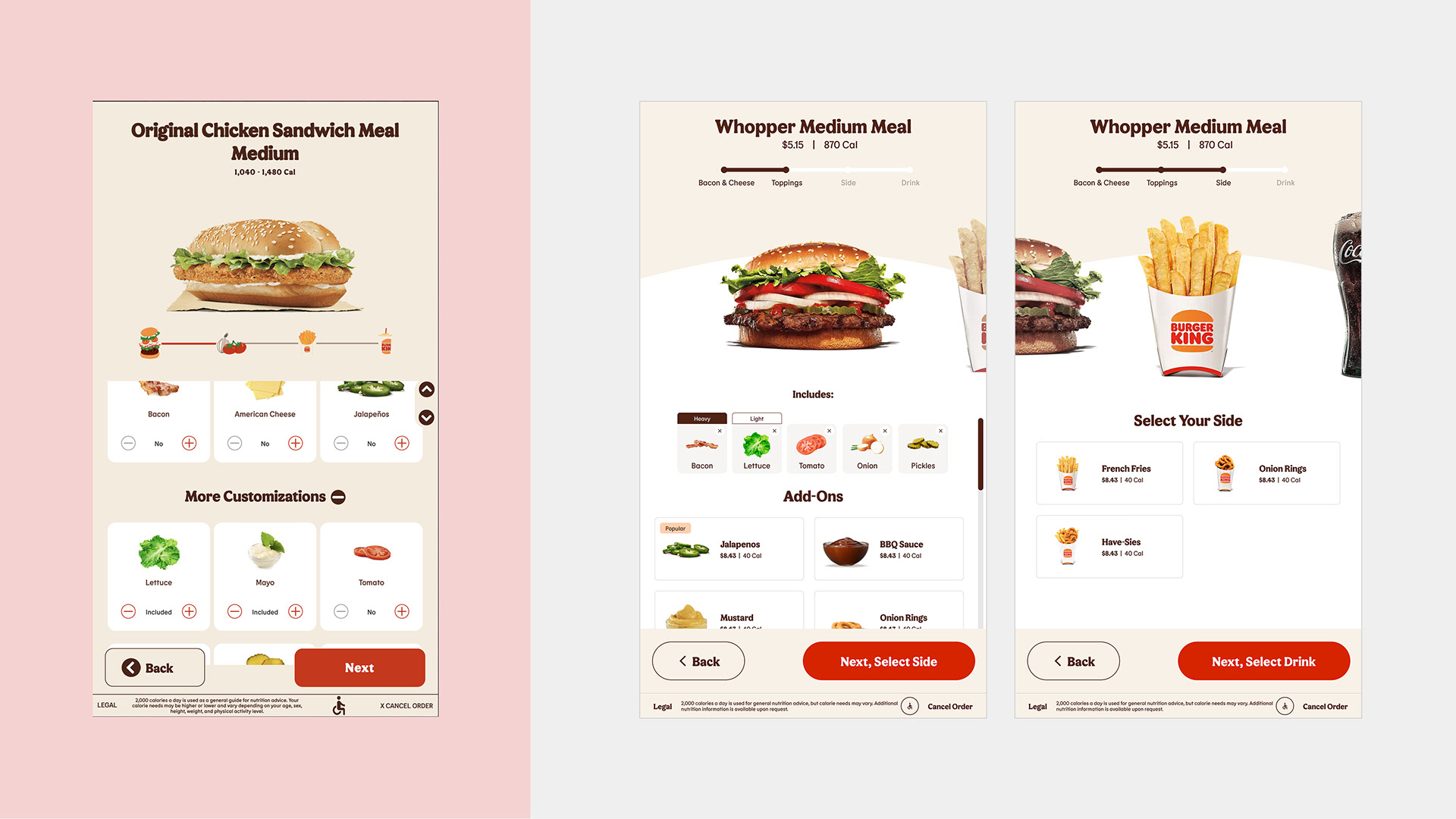
Left — Legacy design
Product customization requires multiple steps, with limited space to display options and modifiers. The layout makes it harder to review choices, and there’s no clear indication of progress through the customization flow.
Product customization requires multiple steps, with limited space to display options and modifiers. The layout makes it harder to review choices, and there’s no clear indication of progress through the customization flow.
Right — Improved design
Larger imagery and subtle animations enhance visual clarity and engagement. Presents more modifier options at a glance through a clear summary list view, with easy access to modifier levels.
Larger imagery and subtle animations enhance visual clarity and engagement. Presents more modifier options at a glance through a clear summary list view, with easy access to modifier levels.
Results & Impact
The kiosk initiative has driven measurable improvements in both business and user experience. Key outcomes include:
• 7% increase in conversion
• $14.23 average check
• 15-second reduction in ordering steps
Steady growth in kiosk sales demonstrates the impact of incremental UX improvements and the successful application of the design system across the experience.